Featured content modules
Featured content modules (FCMs) function to highlight a specific piece of content within a page. They are not integral to the page, and could be removed while leaving the page integrity intact.
Repository
-
cf-layout
FCMs in Capital Framework
Use
Featured content modules should include a single piece of content from a defined content type, including: Blog, News, Video, Event, and Tool.
FCMs appear below the title and introductory paragraph on a page, and retain that position on all screen sizes.
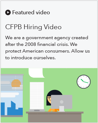
FCMs contain a headline, body copy text, and a graphical element related to the piece of content being featured. They are a “mini story” and never simply a dominant visual.
FCMs can appear on any page type, though they are best suited for pages 3rd level and below in the site map. They are designed to accommodate pages with either a left-hand navigation or right-hand sidebar.
Style at desktop size

- Module is a minimum of 320px total in height with 30px top and bottom padding. It appears 60px underneath the header/intro paragraph of the page.
- Background color of module is Gray 5 with a 1px Gray 50 stroke.
- Module bleeds to the edge of the page, right sidebar and left nav.
- Visual spans 5 columns and bleeds into right sidebar. The visual is sized at 640 x 360px (a 16:9 ratio) for optimal appearance at all screen sizes.
- Text spans 3 columns and is left and top aligned.
- Heading: H2, appears 30px below category, 35 maximum character count (including spaces)
- Body copy: 16px, appears 15px below the headline, 160 maximum character count (including spaces)
- Call to action link: 16px, standard link colors, appears 30px below body copy, 30 maximum character count (including spaces)
- Call to action button: Blue primary button, appears 30px below the body copy
- Category: 18px black minicon and H4 text, appears 30px from top
- The following five categories can be used.
-
Featured event
-
Featured blog
-
Featured video
-
Featured tool
-
Featured news
-
- If the content does not fit within one of the five categories, you may use this icon and prefix:
-
Featured
-
Style at tablet size
Differences in style at tablet size
- Text spans 5 columns
- Visual spans 7 columns
- Visual’s height is fixed, and cropping will occur on both the left and right sides until 700px, when the image will drop below the text and appear at a 16:9 ratio.

Style at mobile size
Differences in style at mobile size
- Module appears 30px underneath the header/intro paragraph of the page
- Headline: H3
- Body copy: 16px
- Visual appears below text at a 16:9 ratio
- 30px space between text and top of visual

